প্রয়োজনে: +88 0170-3419108 (Call/WhatsApp)
Brand Guidelines
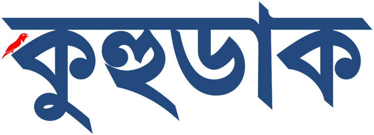
Kuhudak Logo Wordmark
The Kuhudak logo, with its bold yet inviting form, captures the spirit of discovery and connection that defines our journey-driven platform. The design symbolizes the rhythm of footsteps on unfamiliar paths, the excitement of exploring the unknown, and the warmth of human connection across cultures. Its open and dynamic structure reflects Kuhudak’s mission to make travel accessible, meaningful, and enriching for everyone. This logo speaks to our commitment to honest storytelling, inclusive travel guides, and a supportive community that values cultural exchange, sustainability, and wanderlust with purpose.
Logo
Kuhudak Brand Colors
Kuhudak’s brand identity centers on the thoughtful blend of #22497d (Deep Blue), #ff0000 (Red) or RGB: rgb(255, 0, 0), and #FFFFFF (Pure White). These colors represent trust, adventure, and clarity, aligning with Kuhudak’s mission to inspire informed and inclusive travel.
- #22497d is the dominant color, best suited for headers, navigation bars, or content accents on both light and white backgrounds.
- #FF0000 should be used sparingly for buttons, call-to-action elements, and highlights to add vibrancy.
- #FFFFFF acts as a primary background and secondary text color for light-themed layouts.
- Maintain consistent usage of blue and orange together by balancing contrast, especially in logo applications, banners, and UI components.
- For monochrome variants of the logo or wordmark, opt for white-on-dark or dark-on-light combinations to preserve legibility and brand consistency.


